
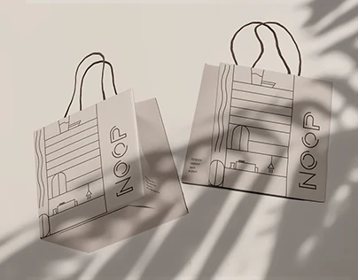
 View Project

NOOP
Branding & art direction
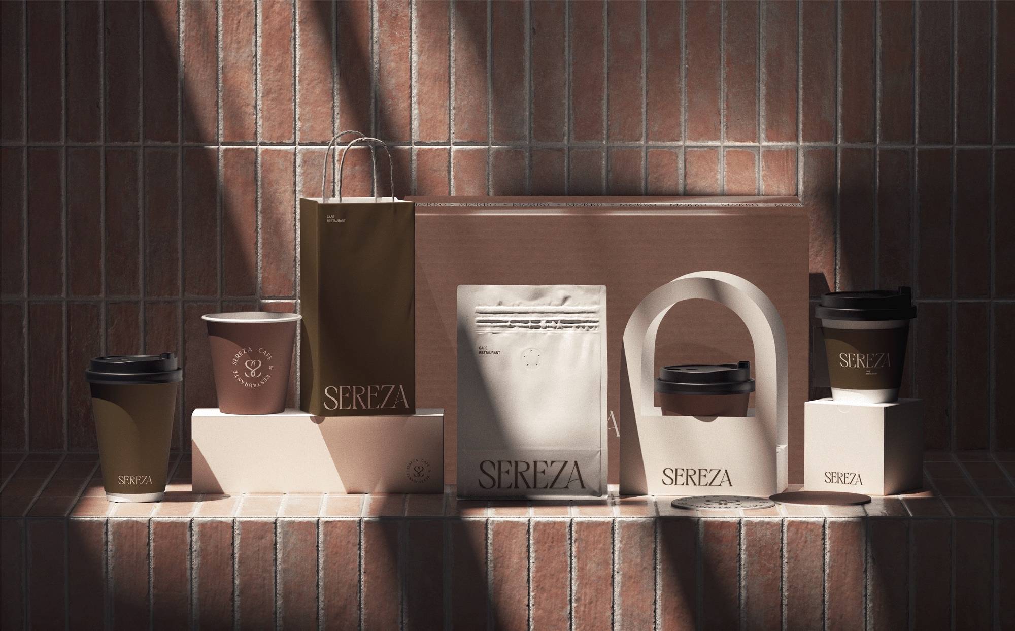
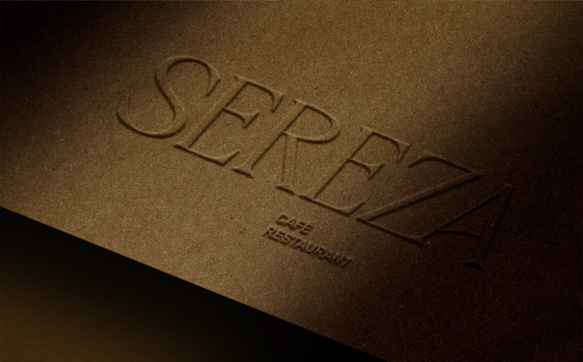
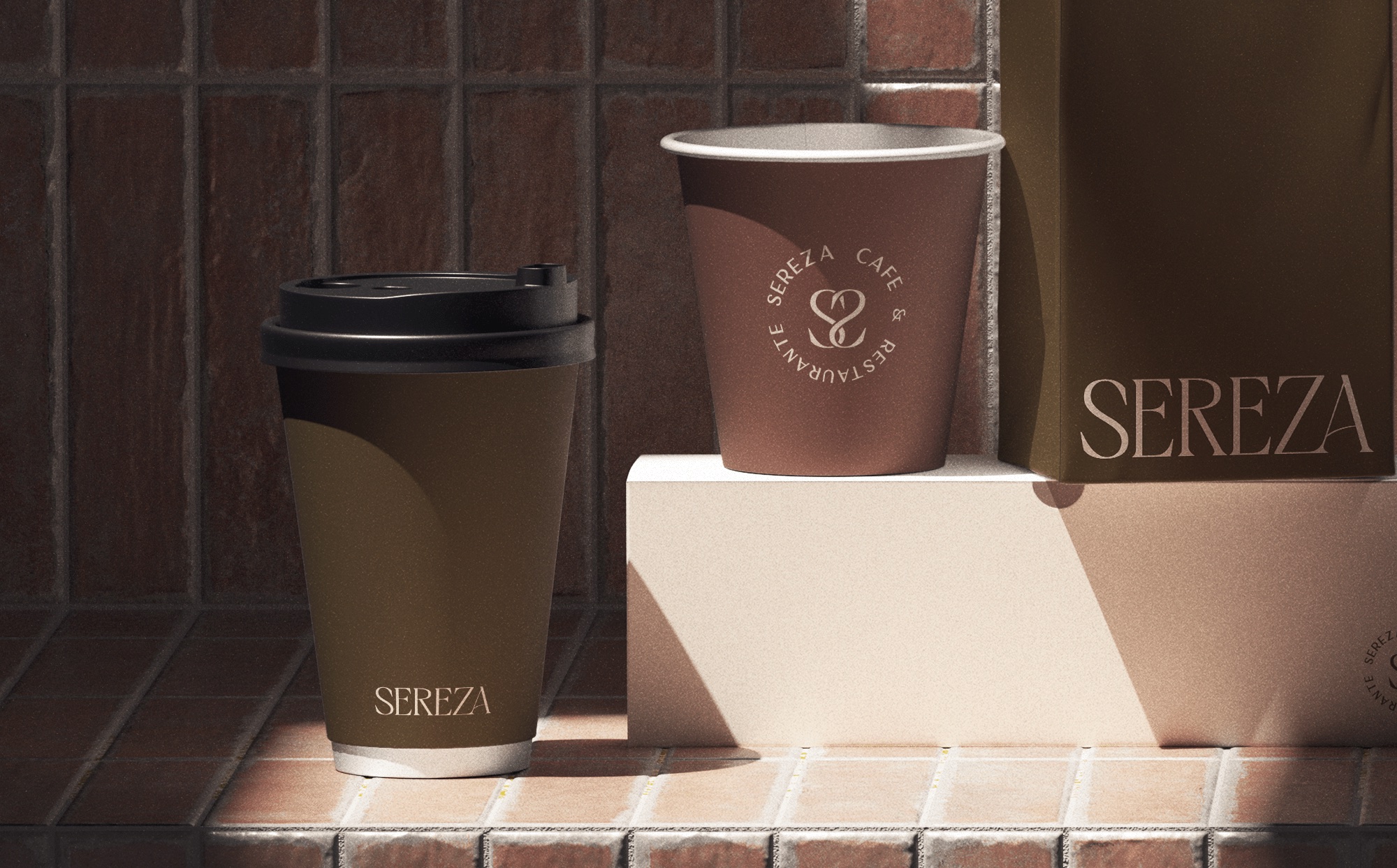
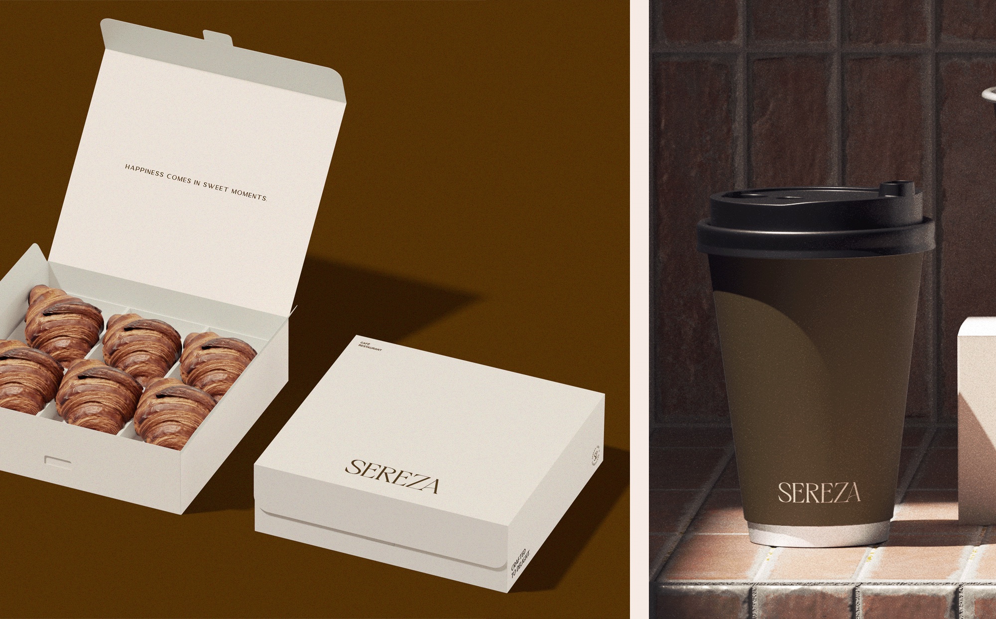
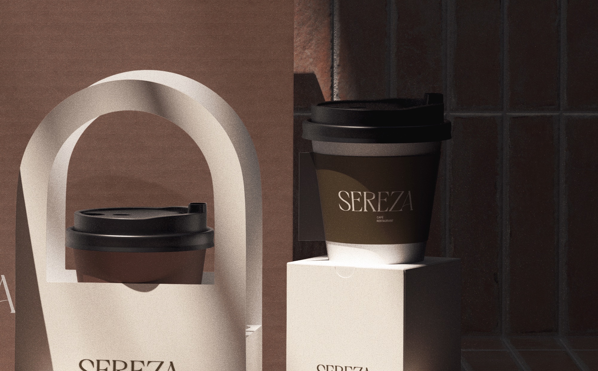
Sereza is a café and restaurant branding concept built around the warmth of everyday rituals: a morning coffee, a shared pastry, and a moment to slow down. The visual identity pairs an elegant serif wordmark with a compact circular monogram, giving the brand a distinctive presence across both large and small applications.
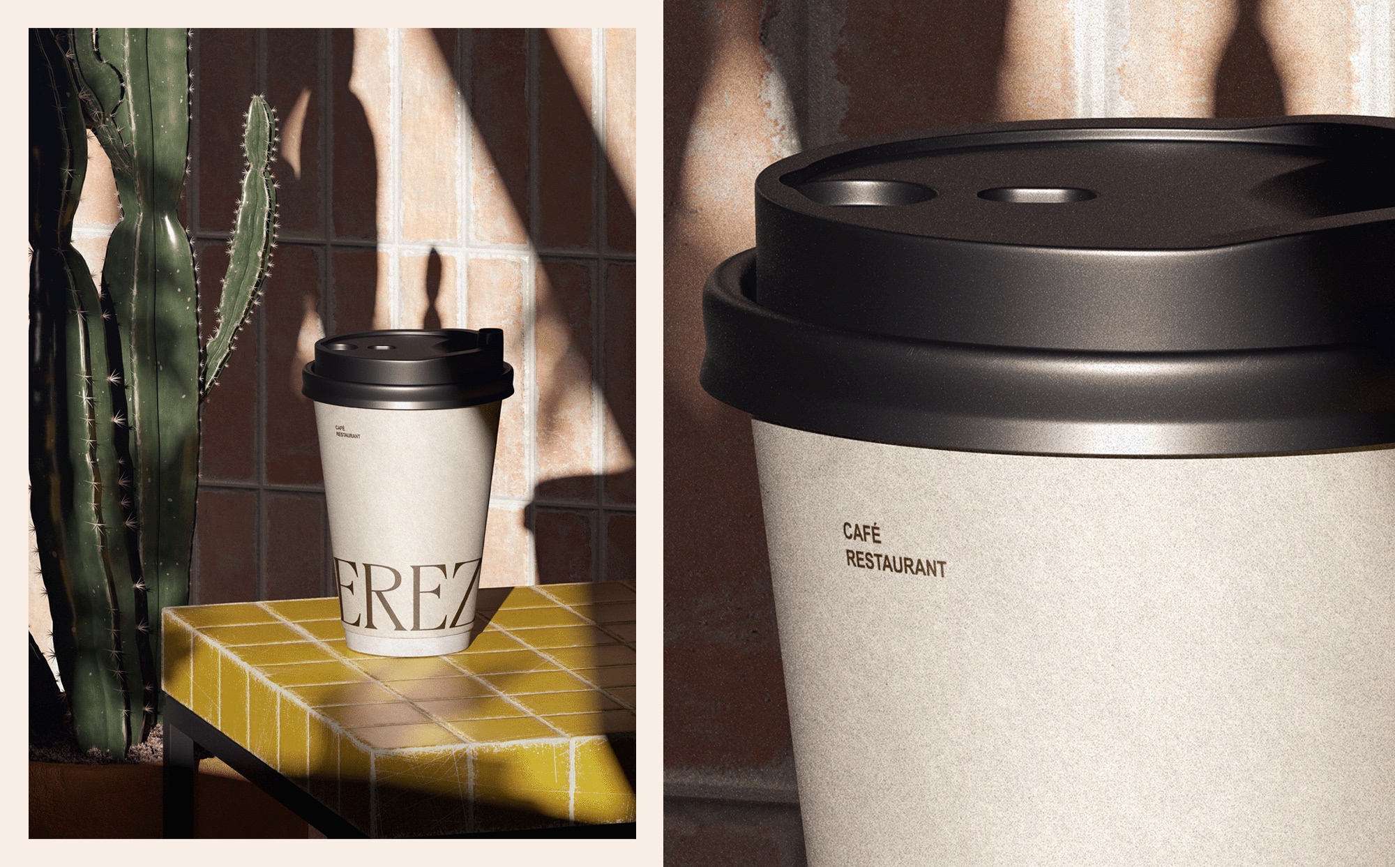
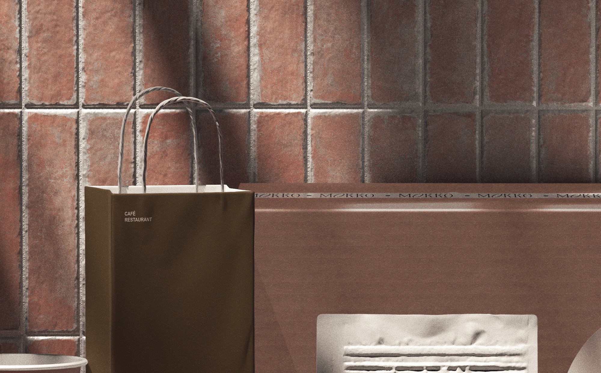
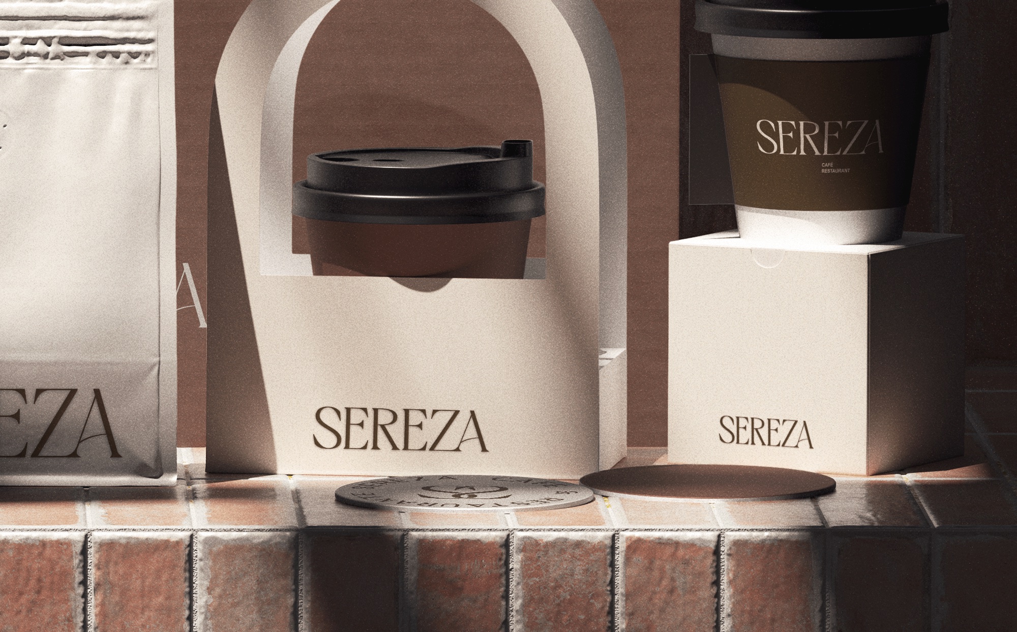
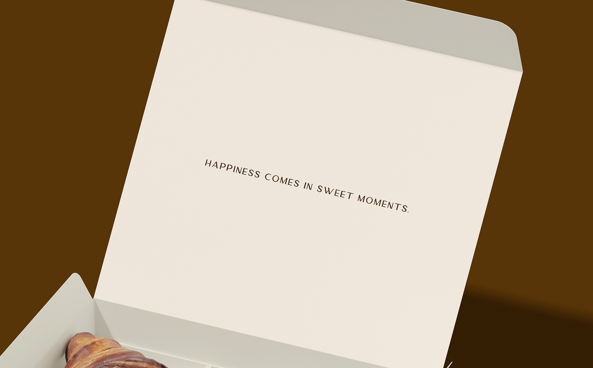
A palette of cream, terracotta, and deep olive brown brings a natural warmth to the collection. Arched shapes, generous spacing, and tactile paper finishes carry the same visual language from takeaway cups to pastry boxes, coffee packaging, bags, and coasters.
The concept explores how one visual identity can work across a complete café packaging collection. Each application balances a clear brand signature with practical space for product and service details.
 View Project
Branding & art direction
 View Project
Visual identity
 View Project
Visual identity & stationery